Nachos Image and video data labeling tool for machine learning
@Deeping Source
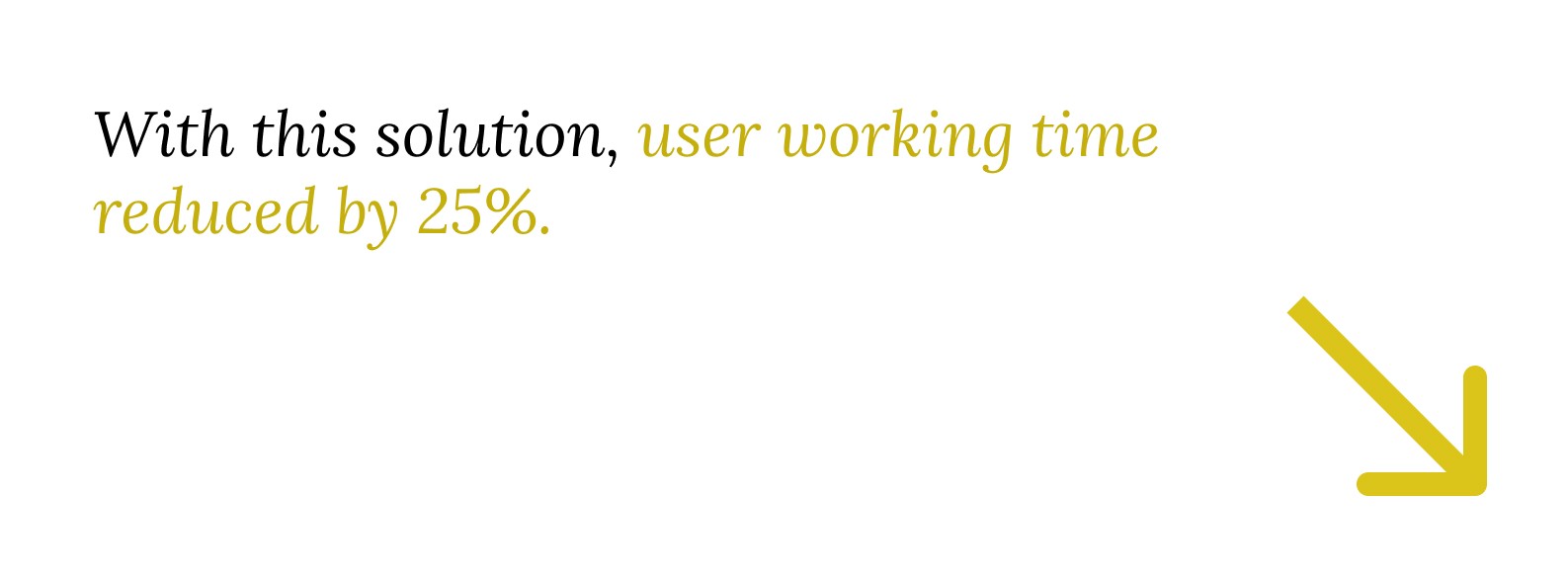
Redesigning Workflow to Reduce Data Labeling Time by 25%
TEAM
1 Product Manager
2 Product Designer (ME)
3 Frontends
1 Backend
SKILL
Figma
Adobe Creative Cloud
Protopie
TIMELINE
Jul – Sep, 2020 (3 months)
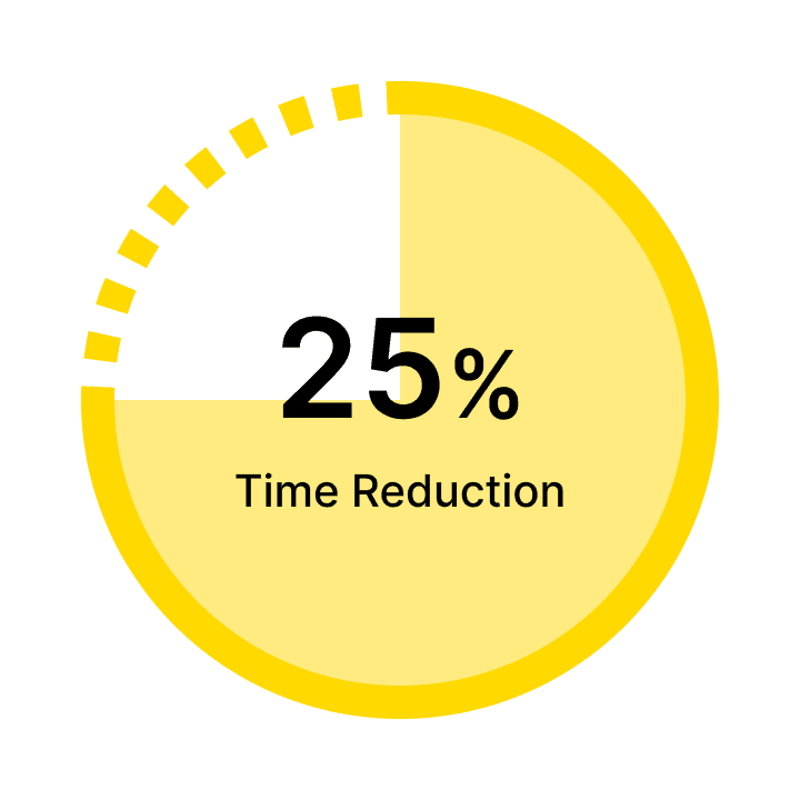
IMPACT
Reduced working time by 25%
PROBLEM
Nachos, a data labeling platform, didn’t support users’ workflows—slowing down dataset production.
Nachos is a data labeling platform for building large-scale image and video datasets for computer vision models.
However, the previous UI didn’t reflect how users actually worked. This forced frequent context switching, broke users’ labeling flow, and ultimately slowed down dataset production.

SOLUTION
Supporting users without pulling them out of their labeling flow
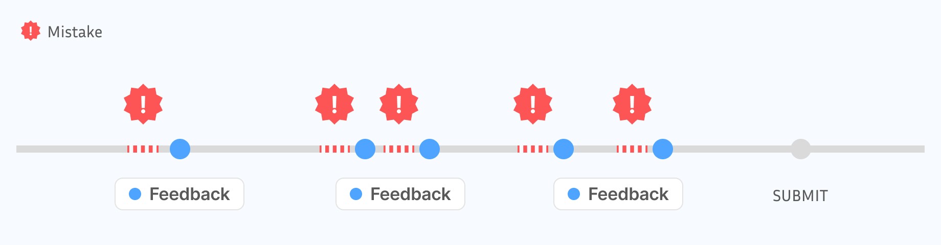
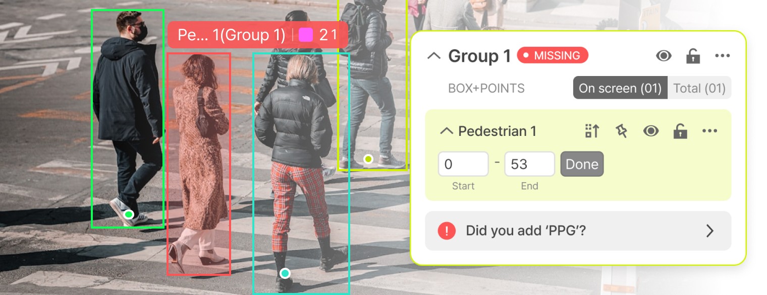
Real-time feedback with contextual action button
Real-time feedback helps users quickly notice and correct missed tasks. An action button inside the label group lets them directly select the tool to draw the missing object.
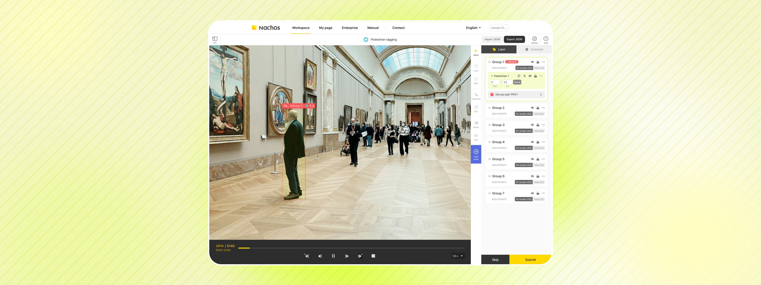
Labeling on Canvas
The “Labeling on Canvas” feature allows users to label directly on the canvas, minimizing navigation and helping them stay focused.
IMPACT
Reduced user working time by 25%
These solutions helped users notice issues and take action without leaving their work—reducing labeling time by 25%.
TL;DR done. Let’s go deeper!
BACKGROUND
Beginner users took nearly 2× longer than experienced users in dataset production
Large differences in working time between users directly slowed down dataset output and increased the cost of scaling the labeling operation.

User Observation (July 28, 2020)
USER OBSERVATION
The problem wasn’t user skill—it was the experience that failed to support users while they were working
To understand the root cause behind this gap, I observed beginner and experienced users performing the same tasks and compared how they navigated the tool.
Beginner Users’ Workflow vs. Experienced Users’ Workflow
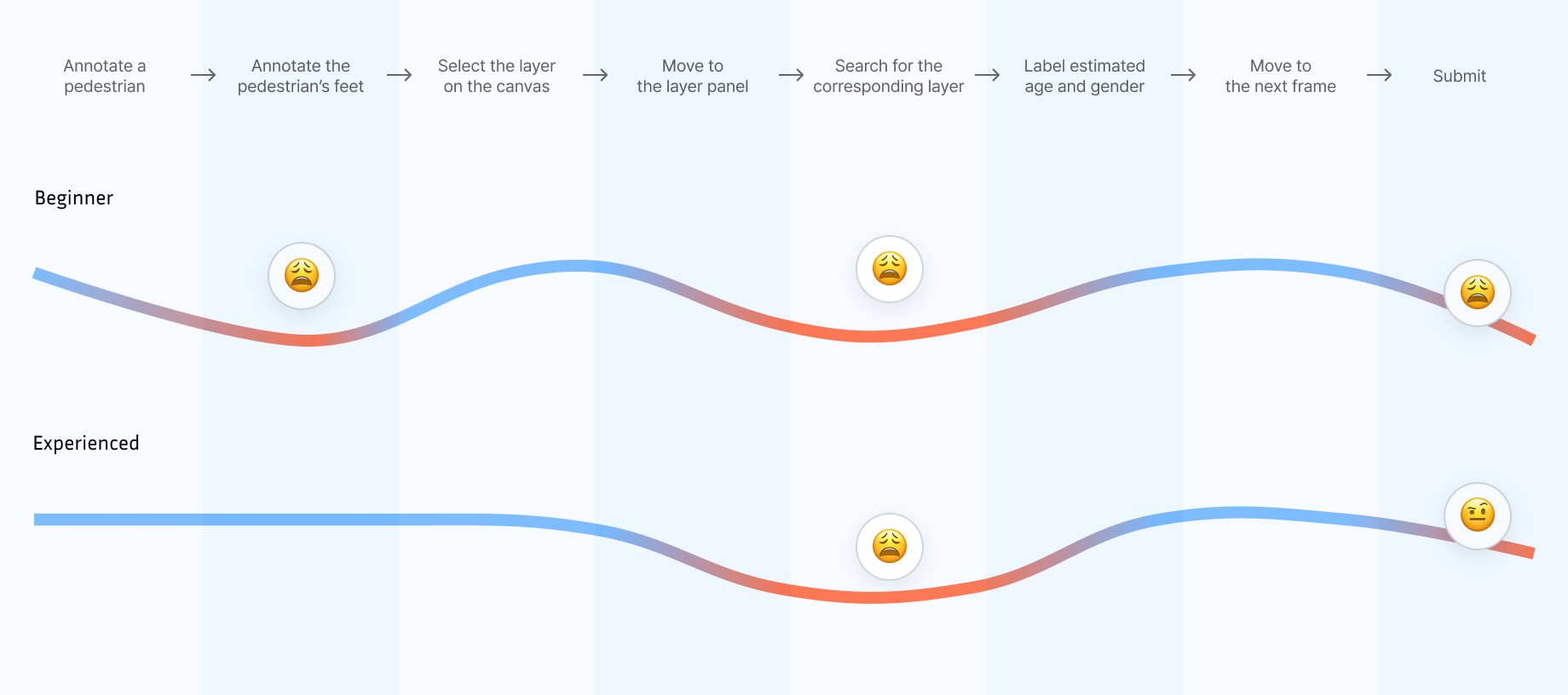
Key Finding
Both beginner and experienced users faced moments where the interface didn’t align with their real workflow.
1
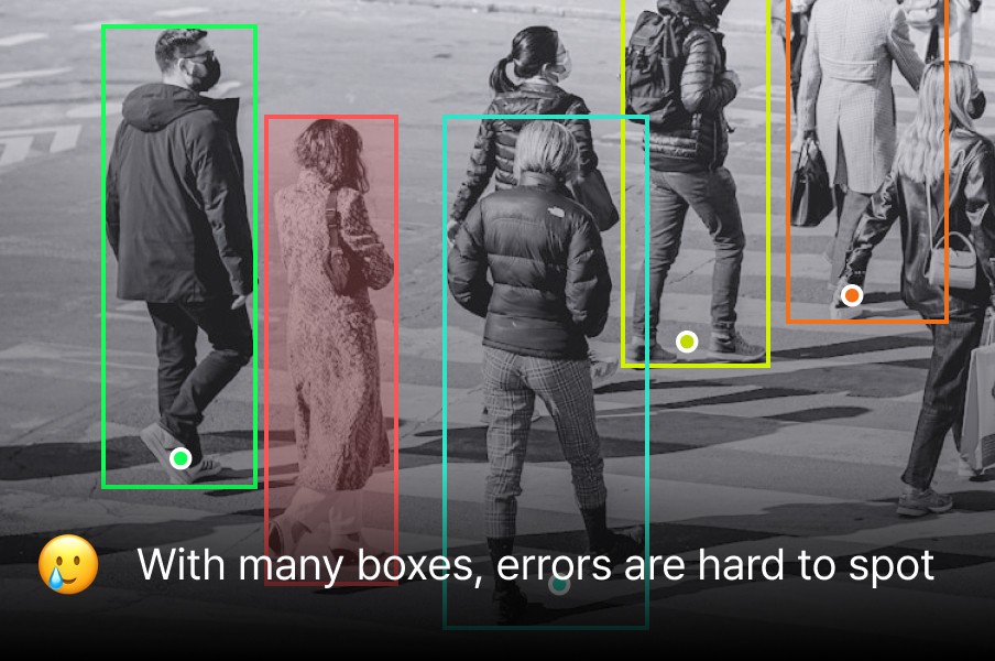
Errors surfaced too late in the workflow
Beginners had no way to notice mistakes while annotating; issues were only revealed after submission.
2
Frequent context switching disrupted focus
For both beginners and experienced users, labeling required constant back-and-forth between the canvas and the label panel, repeatedly pulling users out of their flow.
DESIGN DIRECTION
How might we help users complete labeling without breaking their workflow?
1
Designing for errors surfaced too late in the workflow
DESIGN DECISION 1
The first step was fixing when feedback appears so mistakes surface while users are still in flow
Before
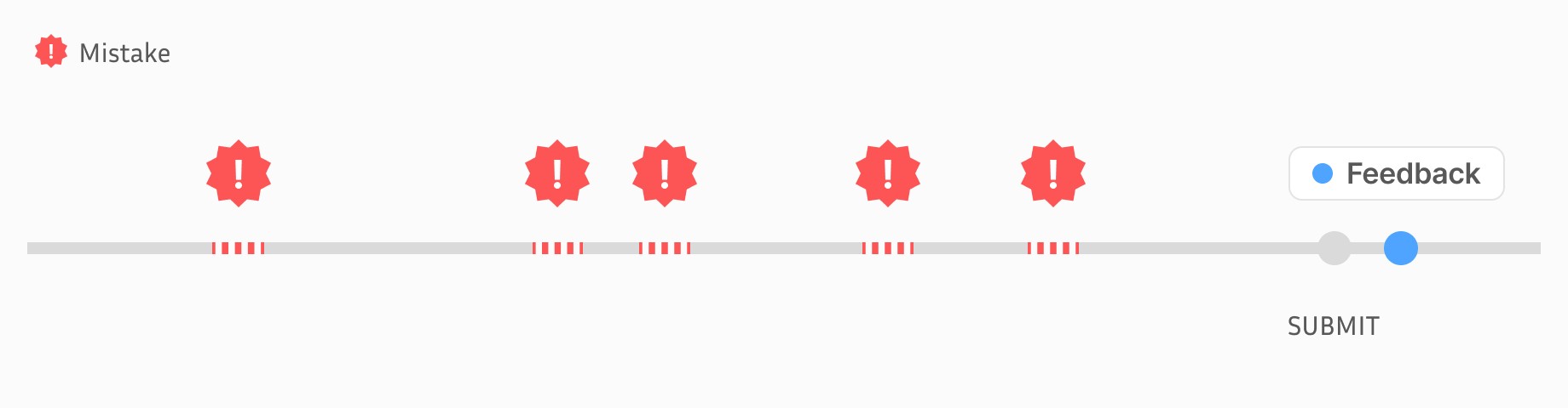
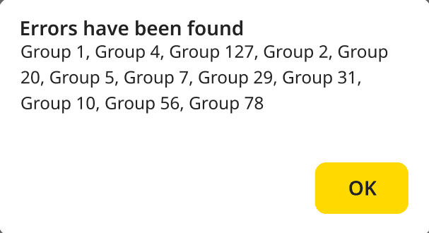
Users could only discover mistakes after completing and submitting all their work, and the feedback they received was often vague.
After
Mistakes are now surfaced immediately, allowing users to notice and correct mistakes before moving on. This was achieved by redesigning the flow to provide feedback at the exact moment an error occurs.
DESIGN DECISION 2
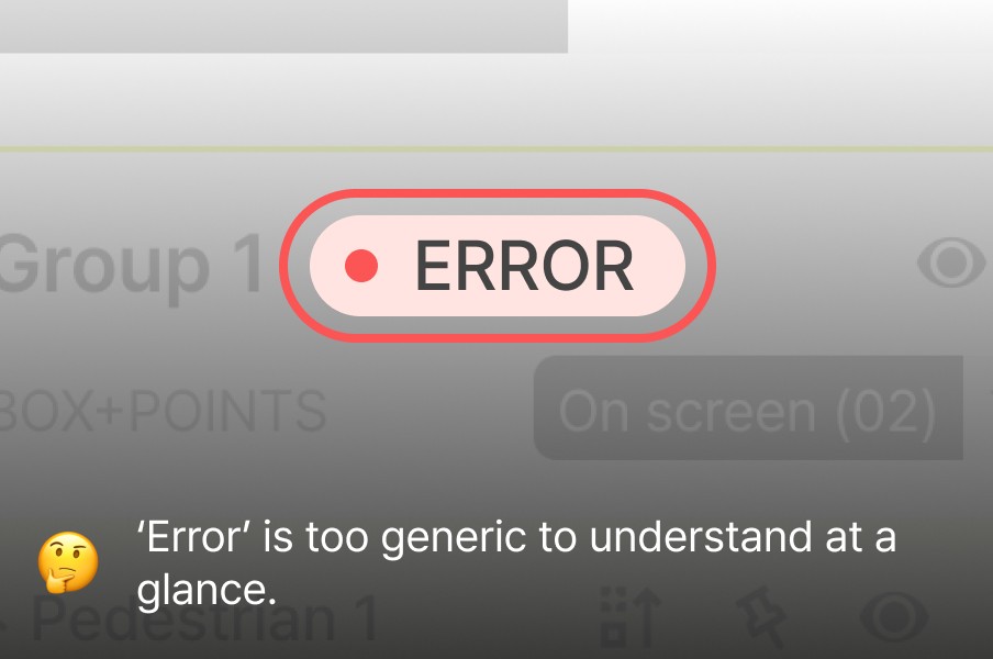
At the same time, I focused on making real-time feedback easy to understand at a glance.
Before
Previously, the feedback UI was hard to understand
After
By leveraging both the Canvas and the Layer Panel, the UI clearly communicates where the issue occurs and what type of problem it is.
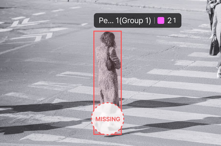
Canvas
Objects with errors were highlighted with a red outline on the Canvas
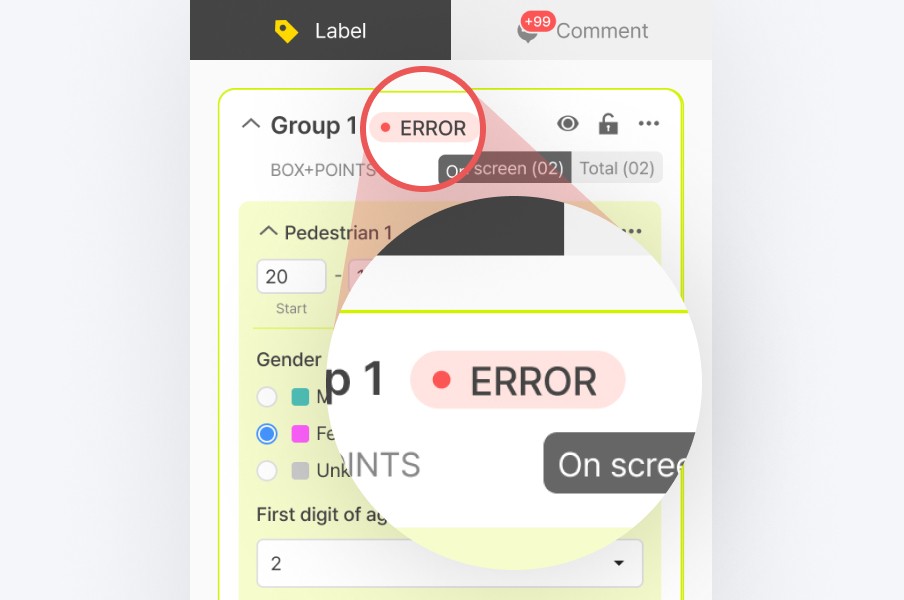
Layer Panel
An “Error” badge was displayed on the corresponding layer in the Layer Panel
Feedback from Labelers' manager
✅ Good
This approach might help users spot issues earlier.
🛑 Need to be improved
Even when errors were visible, they still didn’t stand out enough in dense annotation scenes.
Final Design
Making errors impossible to ignore and easy to fix
Based on the feedback, I highlighted problematic labels in red on the canvas and made the error chips more specific (e.g., “Missing”).
2
Designing for frequent context switching
DESIGN DECISION 3
To address this, I first looked into how other tools handle this problem
Before
Users had to switch between the Canvas and the Label panel to label, causing context switching.

Design Benchmarking
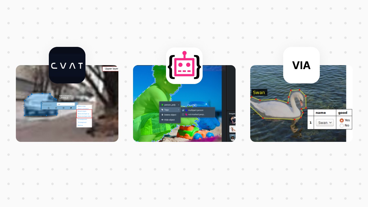
Key Finding
Many tools enable users to label directly on the canvas without navigating to the layer panel.
This approach minimizes eye and mouse movement, helping users stay focused and maintain their workflow.
Final Design
Labeling on canvas
Inspired by competitors’ UI, I brought labeling actions directly onto the canvas, reducing the need for navigation between panels and keeping attention anchored.
Users can now right-click an object to open a context menu with its label options without leaving the canvas.
IMPACT
According to their manager, user working time dropped by around 25%, largely by eliminating time spent searching, switching, and second-guessing.
TAKEAWAY 1
Surface-level problems are not always the real problem
While going deeper than the surface-level problem by comparing beginner and experienced users, I was able to reframe the challenge—from making beginners faster to uncovering where the workflow failed across all users.
TAKEAWAY 2
Even without direct access to end users, meaningful insights can be gathered through observation and proxy feedback
Direct access to end users was limited, so I asked their manager to record how they work and observed the videos. I learned, without direct access to users, I am still able to gain valuable feedback.


© Sejin Kim 2026. All rights reserved.