Nachos — Boosted Efficiency by 25% in a Data Labeling Tool for Beginners & Intermediates
Overview
What is Nachos?
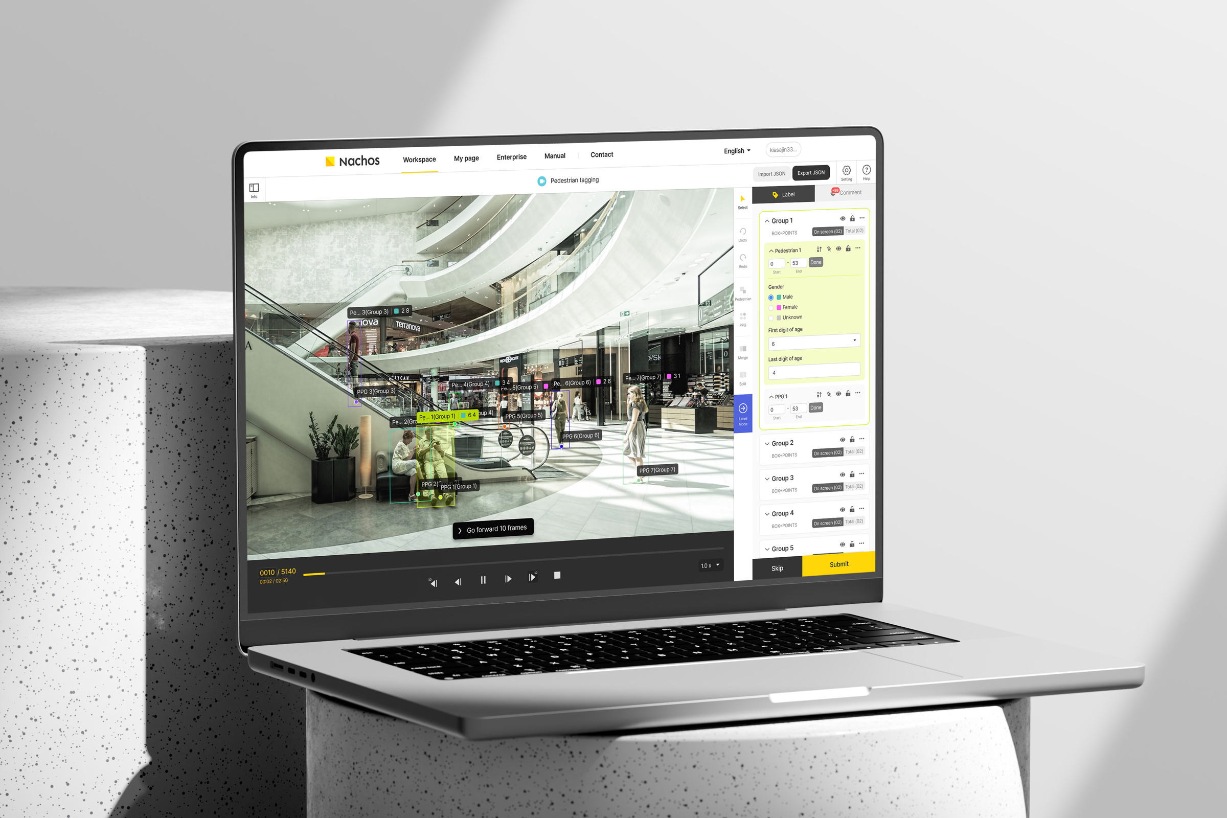
Nachos is a data annotation tool by which users can make dataset for machine learning. At Nachos, hired users can collect raw data (images, videos, etc.) or draw shapes on the data to create AI-readable datasets for machine learning, which is called data labeling.
However, the quality of the datasets is affected by the skills of the user, which in turn depends on the professional experience of the user.Through this project, the user interface has been improved so that Nachos users can quickly and accurately label data regardless of their skill level.
Problem
Novice users often have difficulties and tend to work at a slower pace when using Nachos
Users have a wide range of skill levels from individual to individual. The less experience they have with Nachos, the slower they work and the lower the quality of their datasets.
What is the barrier for low-level users?
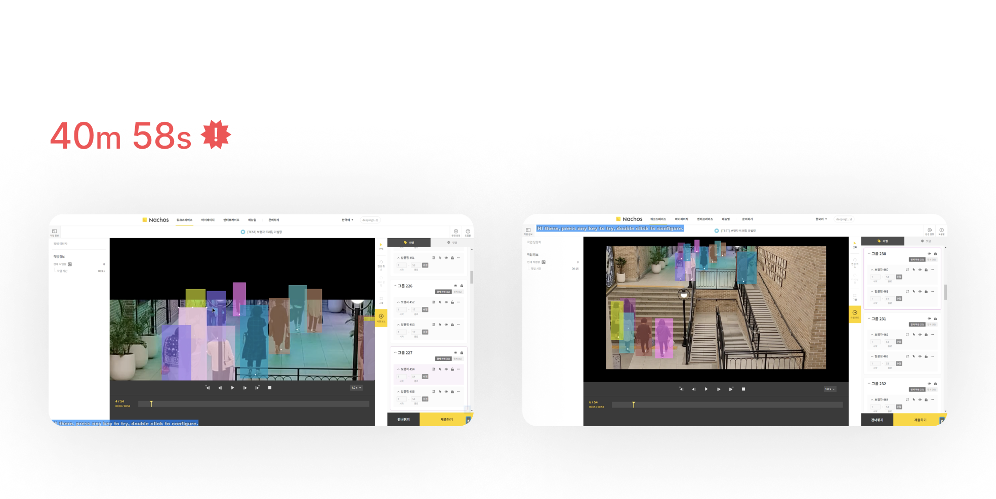
To understand the real problem, I interviewed a manager of our users and observed 2 users, one a novice user and the other an experienced user.

Unnecessary mouse movements
The novice often moved the mouse from the canvas to the label area to type in attributes for a label, often forgetting the attributes of the label on the canvas.

Slow and uncertain feedback
Even when the novice made a mistake, there was no immediate feedback, so the problem could not be solved immediately.

Functions difficult to understand
The novice who didn't know how to use a feature didn't use it in the right place or took a long time to use it.

Visual dizziness
The more labels in the frame, the more difficult it was for both the novice and the experienced user to distinguish between their chosen targets and other targets.
Design Challenge
How can I help users annotating raw data regardless of their work experience?
Solution
Solution 01
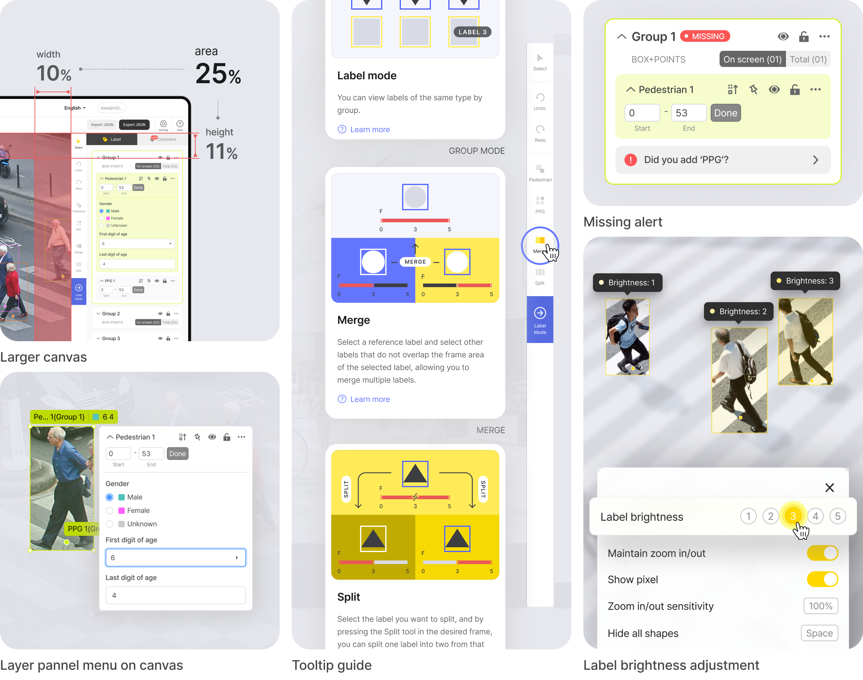
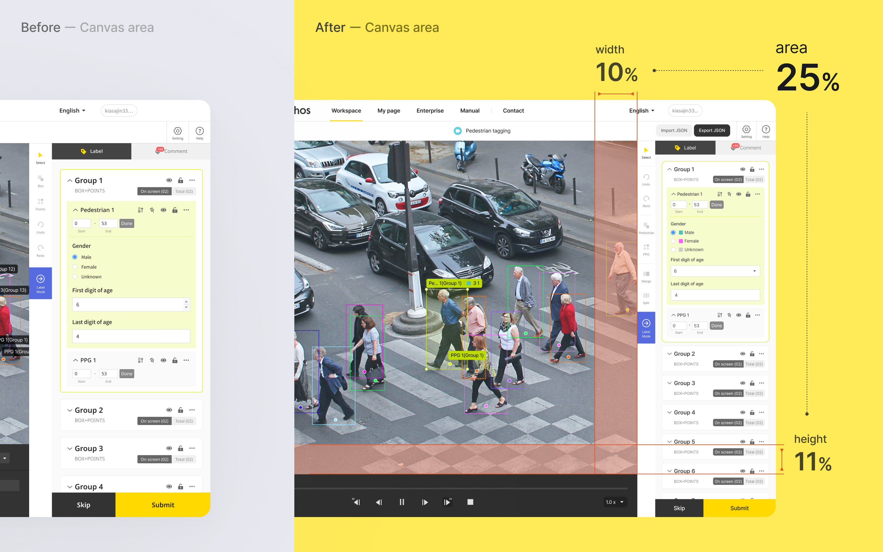
Larger canvas
The canvas area, where people spend a lot of time, has been increased by around 25%, reducing mouse movement and optimising the working environment.
Solution 02
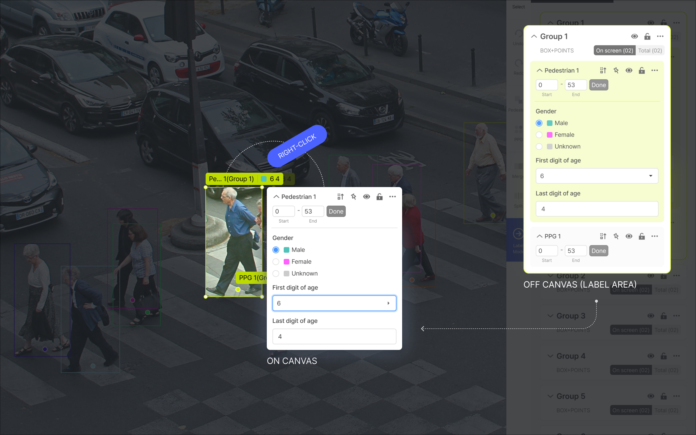
Place functions where the mouse dwells longest
With the introduction of the shortcut menu, the design has been improvedso that the work that needs to be done in the label area can be done on the canvas.
Solution 03
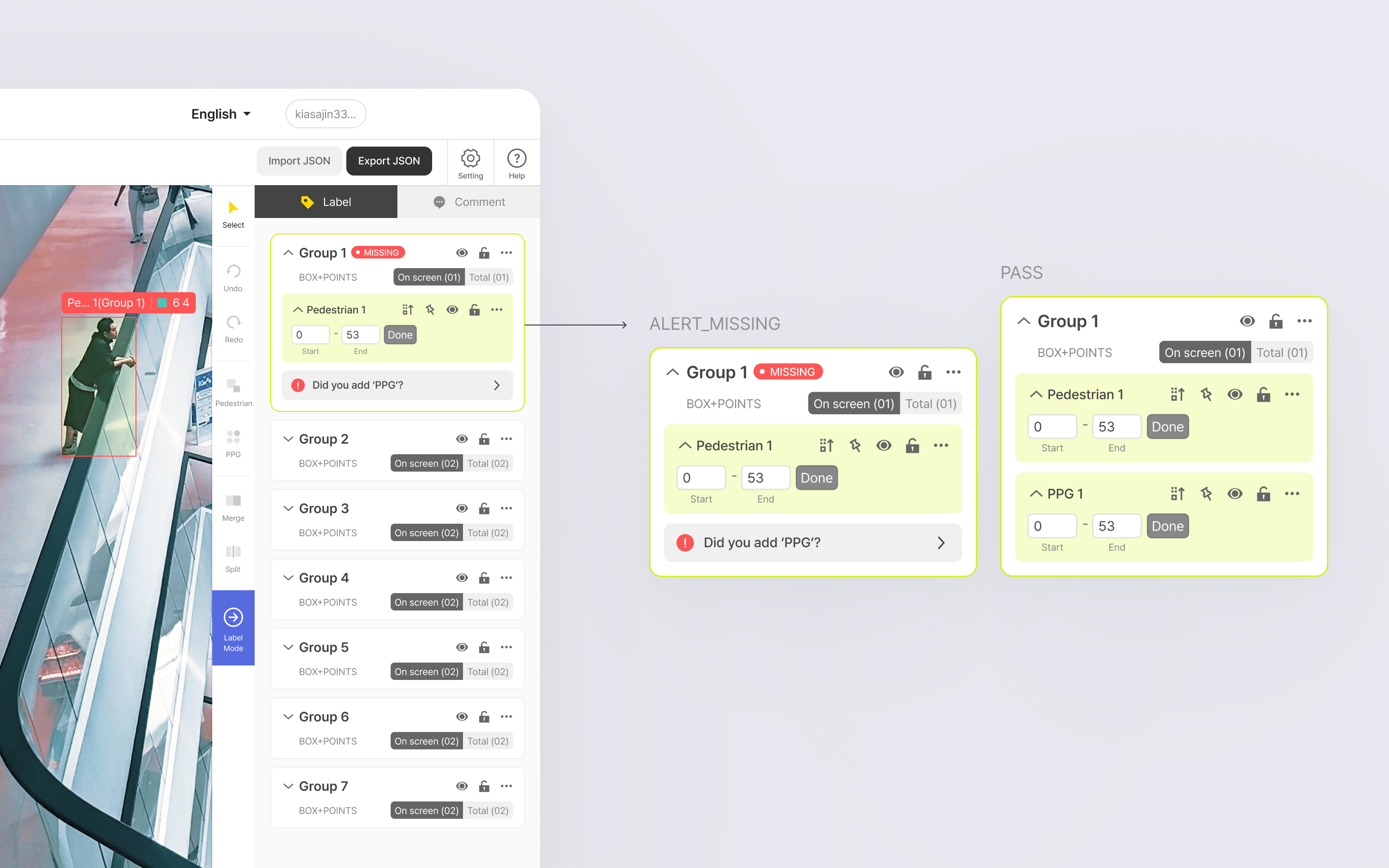
Provide immediate feedback
Incomplete group object warnings were intuitively displayed on the corresponding group objects.
Solution 04
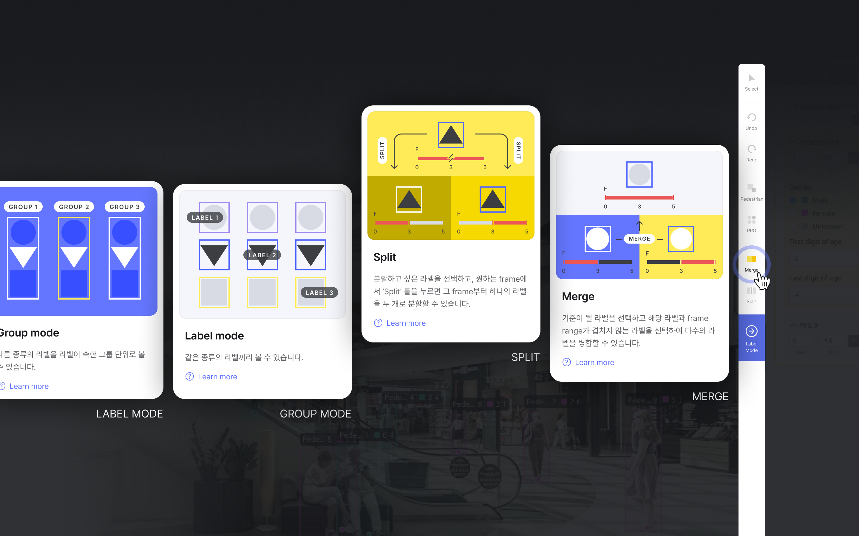
Guides to help users understand functions
A short tooltip for the feature guide has been provided to explain how the feature works, and the Help button has been placed to navigate to the detailed manual for the feature.
Solution 05
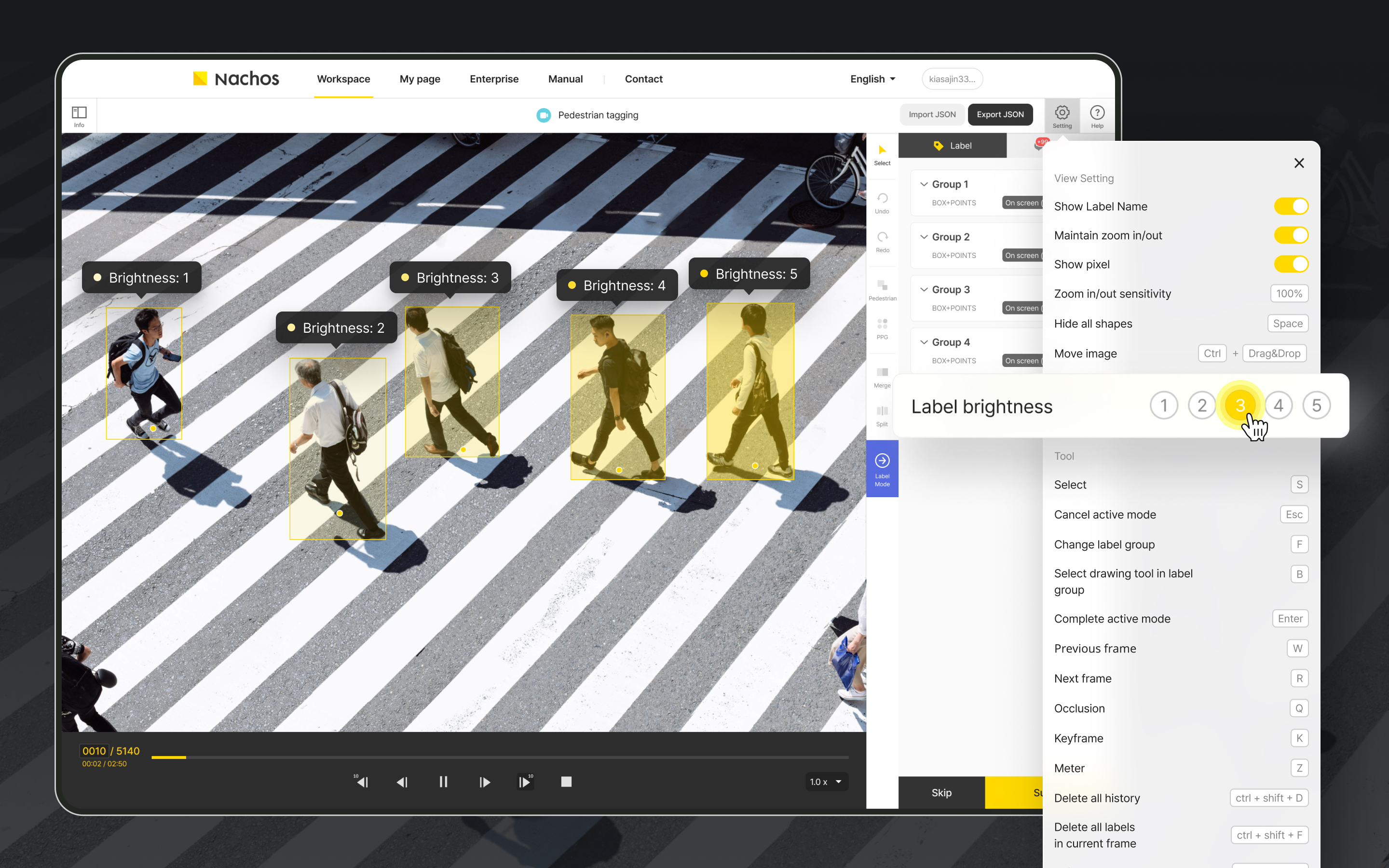
Adjust label brightness
Label brightness has been added to allow users to set their own label brightness, taking into account the use of different labels for different users and tasks.
User analysis
Who uses Nachos?
Nachos users are divided into 3 groups, labelers, validators and administrators. I focused on 'Labelers' for this project because they do much more work than others.

Data Labeler
- Role
Workers who collect or annotate raw data (images, video, etc.) - Goal
Annotate raw data accurately and quickly, and hand off as many datasets as possible to validators. - Work experience
It depends on the individual, but in general there are a lot of beginners. (Because they work almost part-time.)
Work process

Receive data


Annotate data


Group data


Tag attribution


Hand off
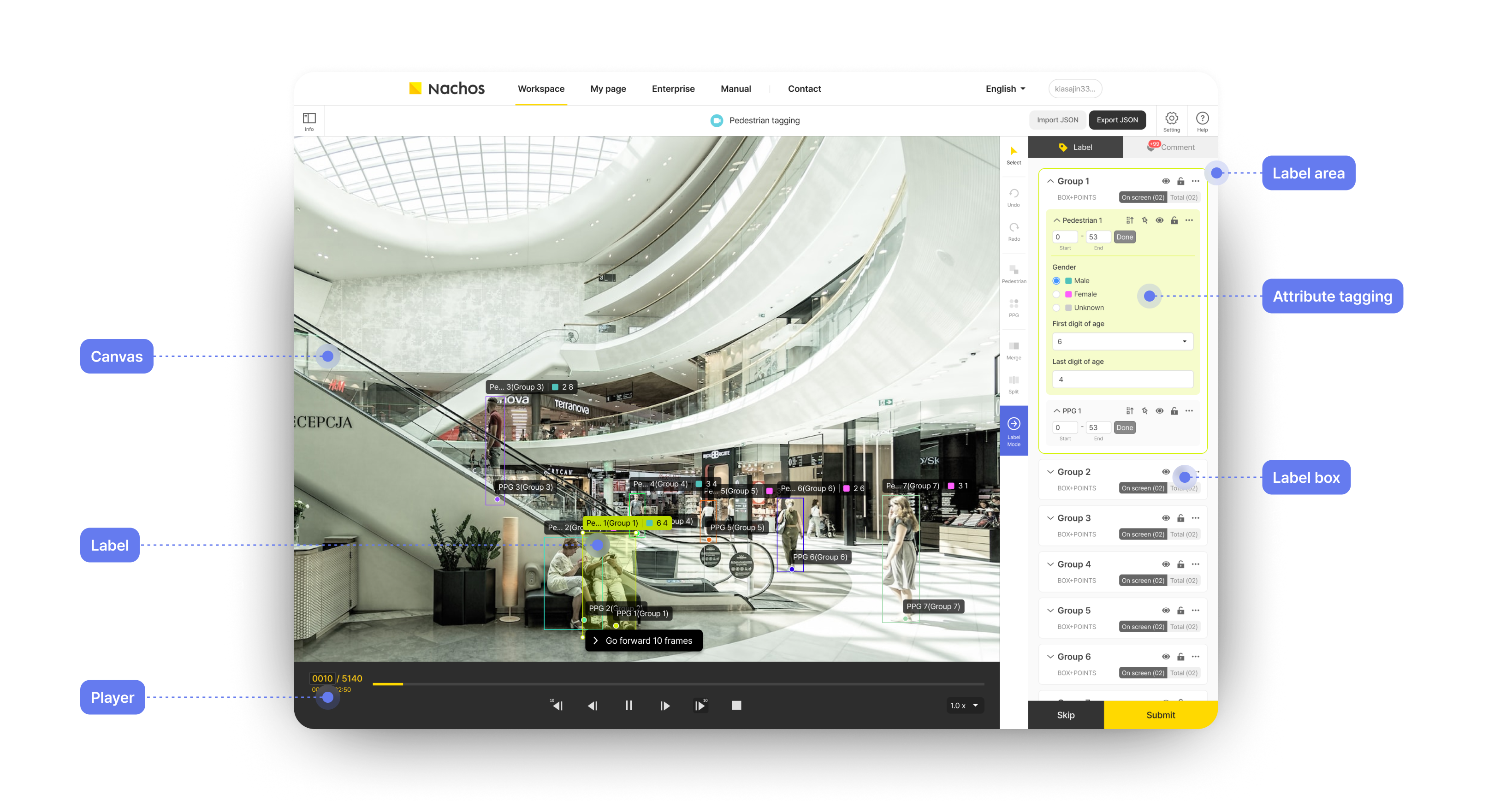
UI description
User research
User interview/observation
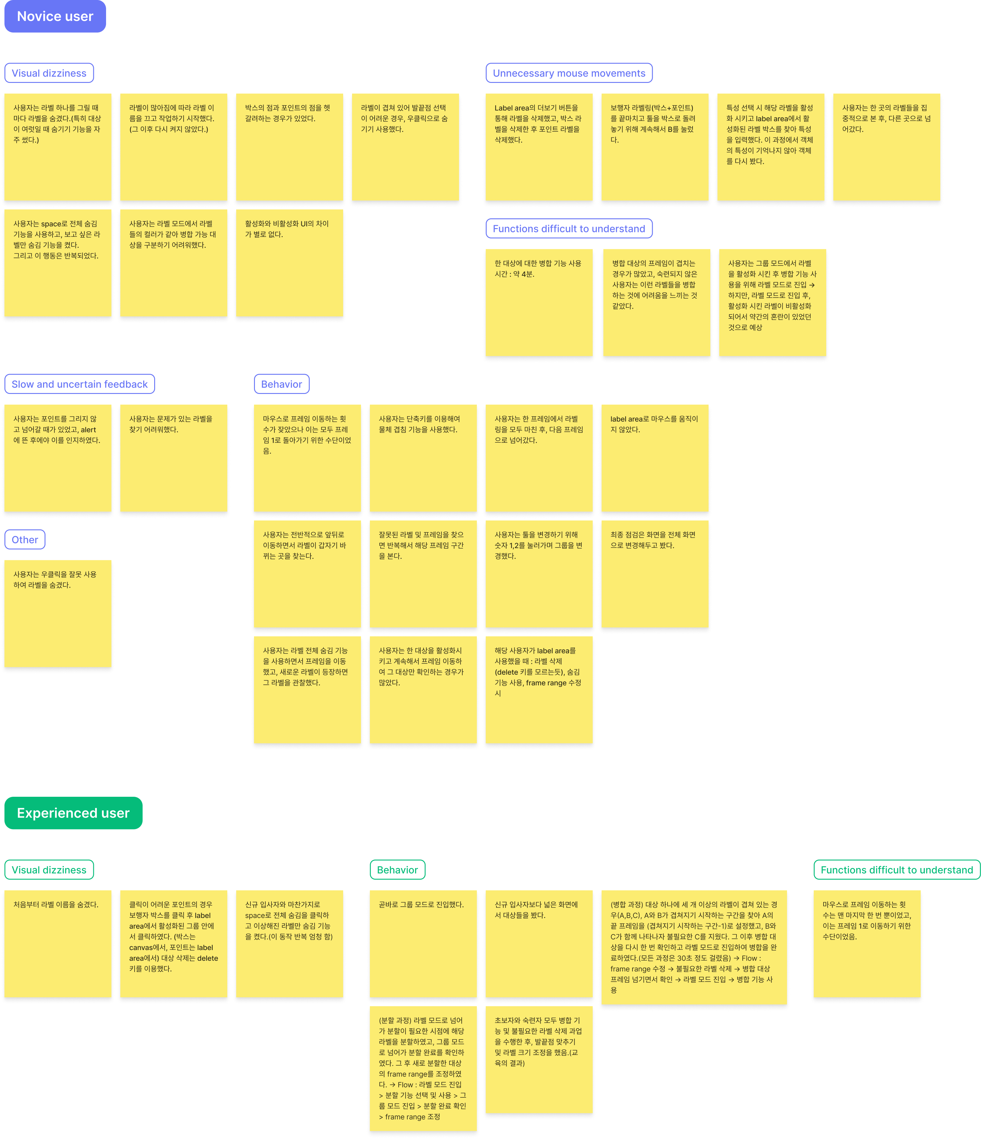
I interviewed the manager who manages the labelers and observed 1 novice and 1 skilled worker actually working to find out what went well and what went wrong. (This observation showed that the difference in working hours between the novice and the expert was more than double).
What went well
- If they were well trained, both novice and experienced users were able to use certain functions.
- Both novice and experienced users moved the frame freely.
- They tried to overcome the limitations of visual dizziness by using the "hide" function.
What went wrong
- Frequent eye movements caused a decrease in work speed.
- It took the novice a long time to use the split/merge function.
- The novice user could not distinguish the color difference between the activation/deactivation labels.
- It was difficult to see if multiple labels overlapped.
- They tried to move on to the next task without grouping the targets, and only after the warning appeared did they realize they hadn't grouped well.
- The alert feedback was not clear.
- The novice user also found it difficult to use basic shortcuts (did not know how to use the Delete key).
- The experienced user had their own know-how or used shortcuts in the right situation, but still experienced visual dizziness and unnecessary eye movements.
Main problem
Problem
I grouped and titled the findings that I learned from the user interview and observation, and this allowed me to know what the main problems were.

Design goal/Solution
Solution Ideation
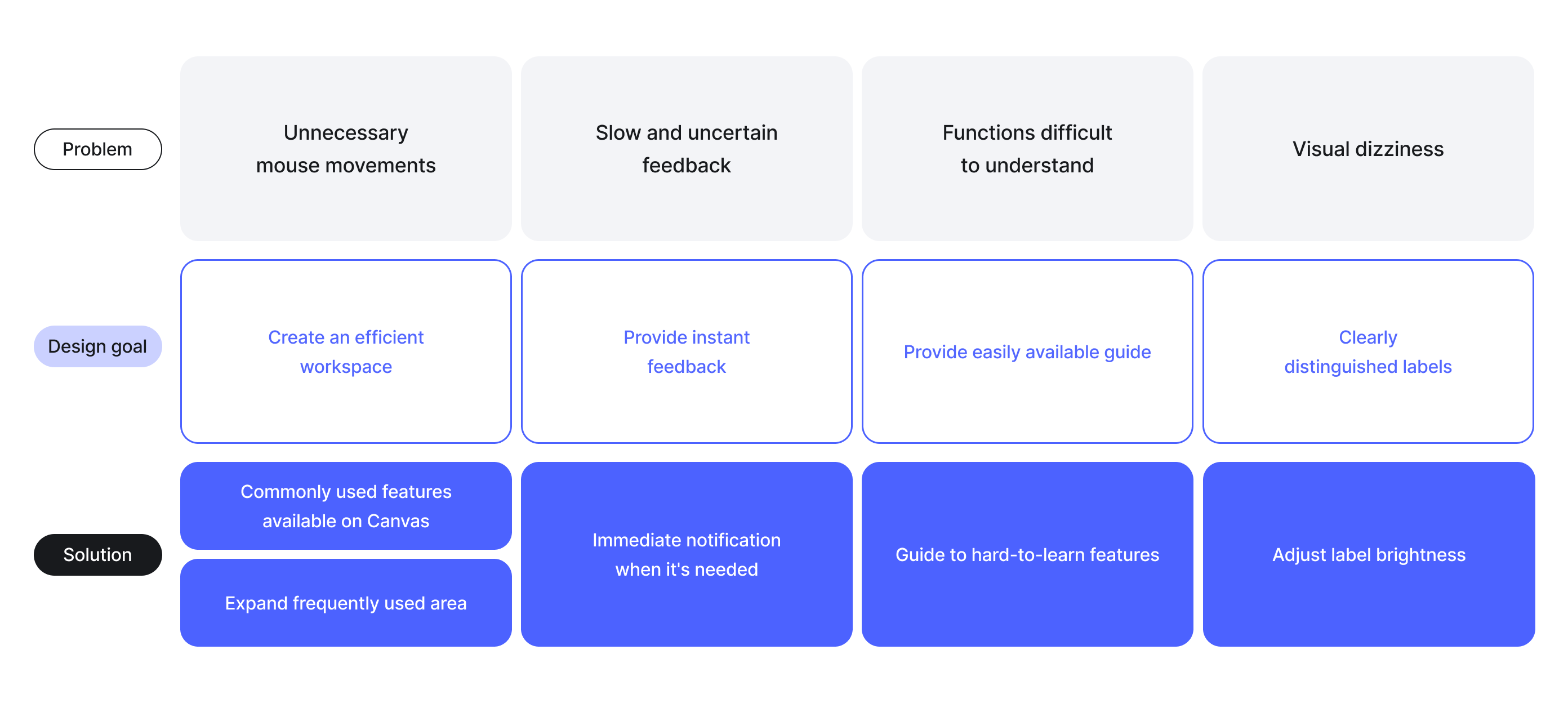
After defining the problems, I set the design goal for each problem and came up with solutions based on the goal. Then, through feedback from the manager and team members, 5 final solutions were selected.

UI Design
UI Design
Finally, I created several user interfaces with a focus on effective presentation and iterated the designs several times. These are the final selected UI designs.
